Keeping your branding colours consistent
Keeping your branding colours consistent is crucial in creating a cohesive and recognisable brand identity.
When each piece of content matches the other in look and feel, you reinforce your brand's image.
Consistent branding builds recognition by making it easier for your customers to recognise and remember you. It creates visual appeal and a consistent colour palette adds a professional touch to your marketing material. It can even encourage your customers to create an emotional connection with your brand when they are exposed to your branding colours repeatedly.
Let’s look at the various colour modes that your business branding will come into contact with, so we can better understand their specific uses.
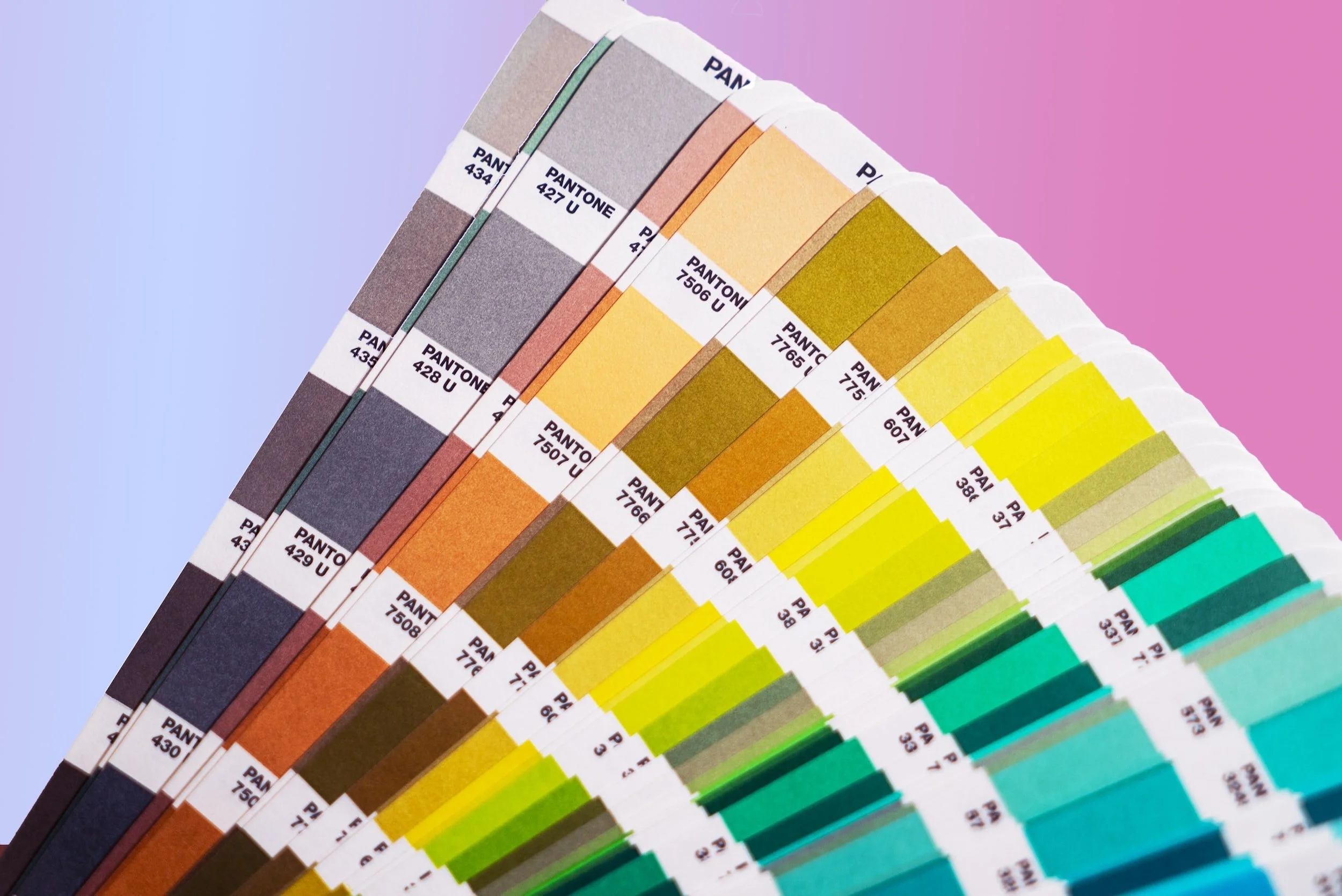
PANTONE
Pantone colours, also known as spot colours, are identified using a numbering system. This colour mode is used when precise colour matching is required, particularly in branding and packaging design. Pantone colours are created using a specified ink formula, ensuring consistency and accuracy. Think McDonald’s - it can only be one specific shade of red to ensure it is internationally recognisable!
Actual Pantone colours are used daily for reference in design but very infrequently for actual printed items as they cost a lot more and usually require a specific method of printing called offset printing.
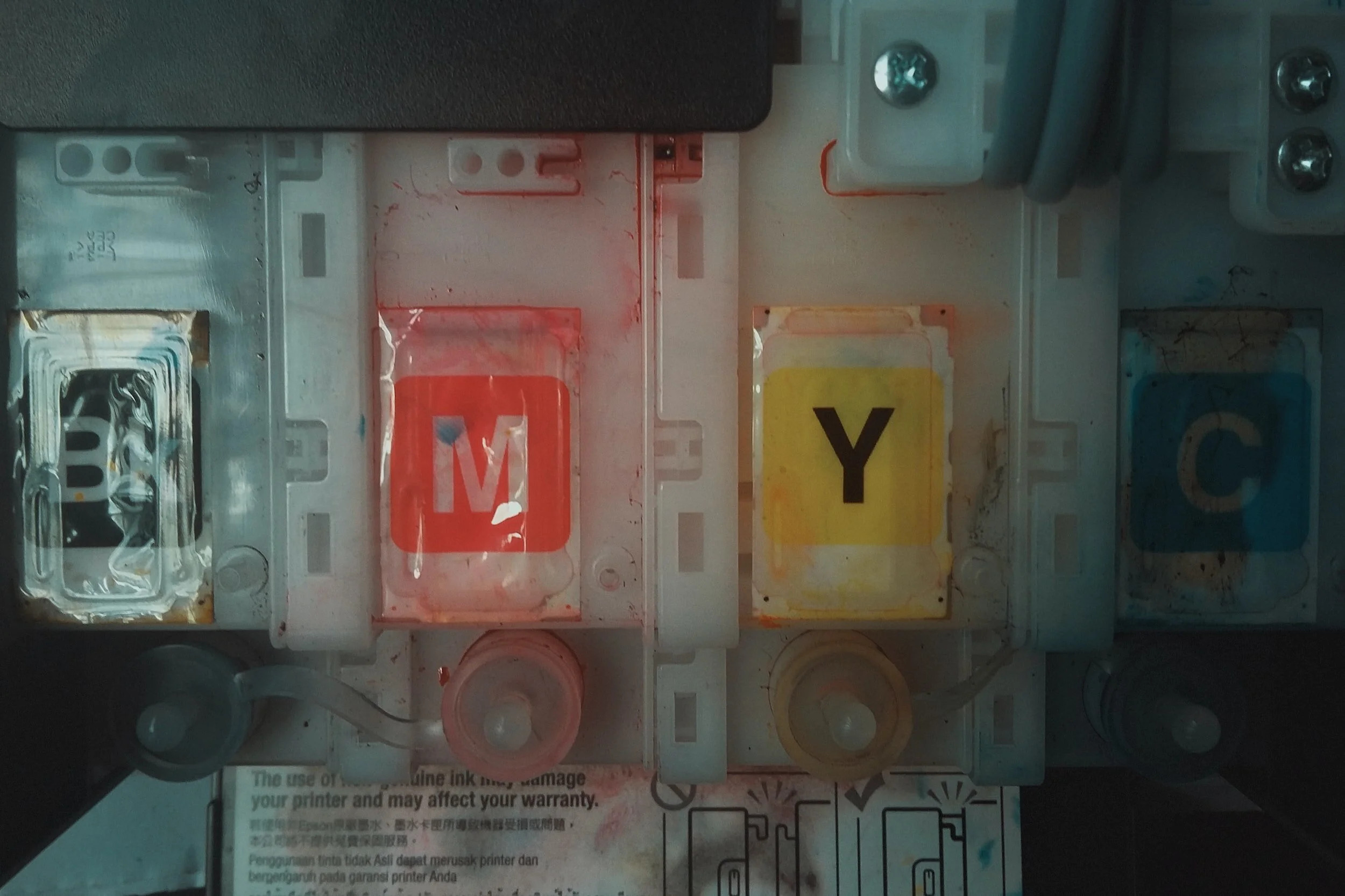
CMYK
CMYK stands for Cyan, Magenta, Yellow, and Black. This colour mode is typically used for print media and is based on the concept of subtractive colour. This means that when printing, you start with a white sheet of paper and then add the four colours in layers using tiny dots, creating the desired colour. CMYK colours can be inconsistent across different printers and paper types so it is important to show your supplier a printed sample of any existing branding you have so they are able to try and match it as close as possible.
RGB
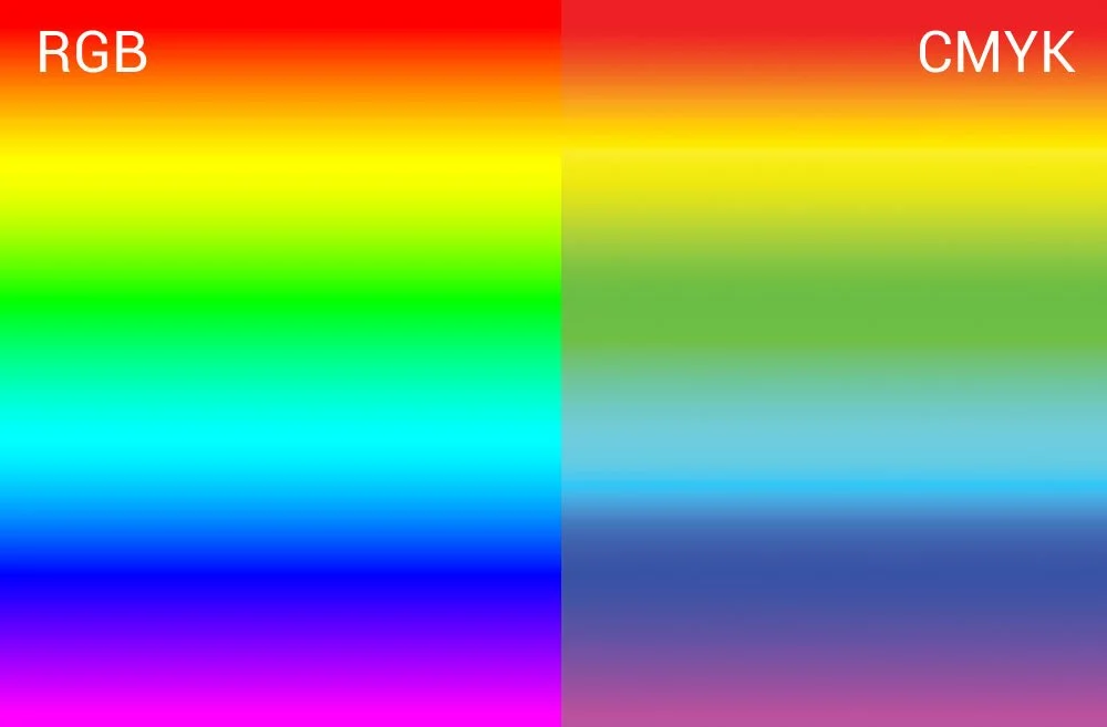
RGB stands for Red, Green, and Blue. This colour mode is used for digital media such as websites, multimedia, and displays. In contrast to CMYK, RGB is based on the concept of additive colour, where more colours are added to produce brighter and lighter colours. For example, when fully combining Red, Green, and Blue lights, the result is white. However, RGB colours can appear differently on different screens due to differences in screen calibration and settings.
It is important to remember that RGB colour can appear much brighter on screen than in real life. A perfect example of this would be fluoro colours which are near impossible to recreate with a CMYK printer and would need to be printed using Pantone inks. Bear this in mind when you are getting illustrations or designs created.
HEX
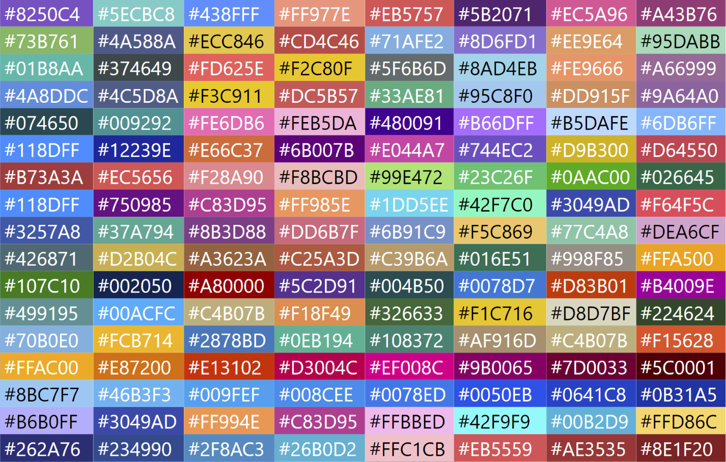
Hex colours are a 6-digit code that represents a specific colour in digital design. This colour mode is used primarily for web design. Hex colours are based on the RGB colour space, represented in hexadecimal format, and are commonly displayed as a “#” followed by a series of six letters or numbers. For example, #000000 represents the colour black, while #FFFFFF represents white.
Hex colours are becoming increasingly popular in everyday use with the introduction of user-friendly platforms like Canva. Just remember, the colour you see on your screen may look different on other screens or in print which may result in inconsistencies in your branding colours across your marketing materials.
Understanding the differences between CMYK, RGB, Hex, and Pantone colours is vital in the world of design.
A useful way to remember it is CMYK is typically used for print media, RGB for digital media, Hex for web design and Pantone for precise colour matching. It's essential to keep in mind the differences between these colour modes, so that you can ensure your business branding is accurately represented across various platforms.
The beauty of working closely with a designer is that they can help you find a match for your branding across all platforms so that your business looks amazing whether in print, on the road or online.
If you need help consolidating your branding or creating a palette from scratch, feel free to reach out here


